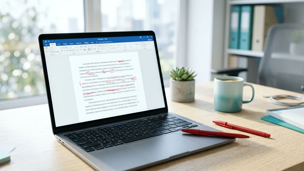
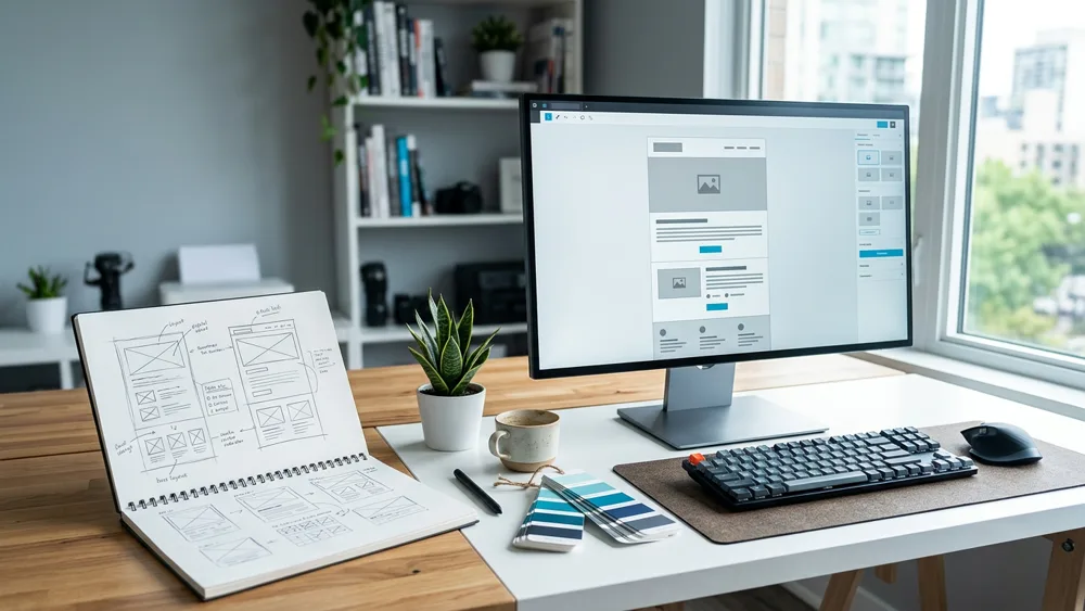
Most teams treat design and deliverability as different jobs: designers make it pretty, deliverability people keep it out of spam. That split is why so much beautiful email never gets seen. Email design and deliverability are the same problem, because spam filters read your HTML before any human does, and heavy code, image-only layouts, and shady link patterns get a message filtered on sight. SpamCipher runs unlimited email sending on SpamCipher ONE, with every mailbox kept inside its own daily cap, automated cold email sequences and inbox placement tests on its own seed mailboxes, so we spend a lot of time looking at why well-designed mail fails. Here are the ten design decisions that decide it, in the order filters meet them.
Email design and deliverability: why filters read your HTML first
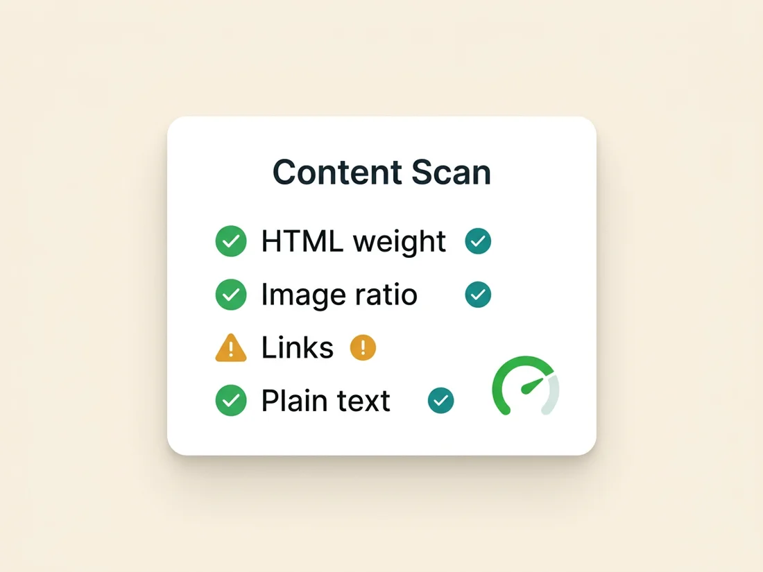
When your message arrives, the receiving filter parses the raw MIME: the HTML weight, the ratio of image pixels to text characters, the number and destination of links, the fonts and styles, the presence of a plain-text alternative. All of that is scored before rendering, alongside your authentication and sender reputation. Design is literally part of the spam score. That means every choice below is not a taste question, it is a placement question, and each one is something you control completely. The list runs from the skeleton outward: structure first, content patterns second, experience and proof last.
Ways 1-4: structure and weight
1. Keep the HTML lean. Gmail clips messages larger than 102KB, hiding the rest behind a "View entire message" link, and clipped mail loses your unsubscribe link and your tracking footer, both of which hurt you. Bloated HTML also correlates with template-builder junk code that filters associate with bulk mail. Aim well under 100KB; a typical marketing email has no business over 60KB.
2. Balance image-to-text ratio. The one-giant-image email is a classic spammer trick, because it hides the words from text filters, and modern filters treat it accordingly. Keep the message majority text by area, roughly 60/40 text to images, and never put the core message only inside an image. Always set alt text so the message survives image blocking, which several clients still apply to unknown senders by default.
3. Always send a real plain-text part. Proper email is multipart: an HTML version and a plain-text version of the same content. Mail that ships HTML with no text alternative, or with a mismatched one, looks machine-generated and scores worse. Most ESPs generate the text part automatically; check it reads like a sane email rather than a dump of URLs and menu labels.
4. Practice link hygiene. Filters count your links, resolve where they point, and compare the visible text to the destination. Keep the count low, make every link's text honest about where it goes, and never use public link shorteners, which are so abused by spammers that some filters flag them outright. Every domain you link to brings its own reputation into your score, so link only to domains you would vouch for, ideally your own.
Ways 5-7: content patterns filters hate
5. Drop the spam-costume styling. ALL-CAPS subject lines, giant red fonts, walls of exclamation marks, and currency-symbol confetti are the visual dialect of spam, and filters learned it decades ago. One emoji is fine; five is a pattern. If a styling choice would look at home in a "YOU WON" email, it is renting you spam-folder placement. The full list of offenders is in our piece on the content mistakes that quietly send you to spam.
6. Use safe typography and boring CSS. Stick to widely supported system fonts or well-known web fonts with a system fallback, and inline your CSS; several clients strip style blocks. Skip anything clever: JavaScript is stripped everywhere and its presence is a red flag, forms break in most clients, and video embeds mostly do not play. Attachments on marketing or outreach mail are the single fastest way to look like malware; link to files instead.
7. Design mobile-first, single column. More than half of opens happen on phones. A single-column layout under 640px wide with readable 16px+ body text is not just kinder to readers, it protects engagement, and engagement is a ranking signal. Mail that renders broken gets deleted unread or marked as spam, and both of those signals train the filter against your next send. Broken-on-mobile design is also a big reason bulk mail gets shunted to the Promotions tab; we cover that battle separately in how to escape the Gmail Promotions tab.
Ways 8-10: experience, trust, and proof
8. Handle dark mode on purpose. Roughly a third of readers view mail in dark mode, where clients invert colors unpredictably: dark logos vanish into dark backgrounds, and low-contrast text becomes unreadable. Use transparent PNGs with padding or a light outline, test both modes, and avoid pure black and pure white as design anchors. Unreadable mail gets deleted, and deletions-without-reading are negative engagement.
9. Make the unsubscribe link easy to find. This feels backwards and is not. A reader who cannot find the unsubscribe link does not give up, they hit "Report spam" instead, and one complaint hurts you more than a hundred unsubscribes. Since the 2024 bulk-sender rules, Gmail and Yahoo require one-click unsubscribe anyway. A visible unsubscribe, a real postal address, and a from-name that matches your brand are trust signals for both the filter and the human.
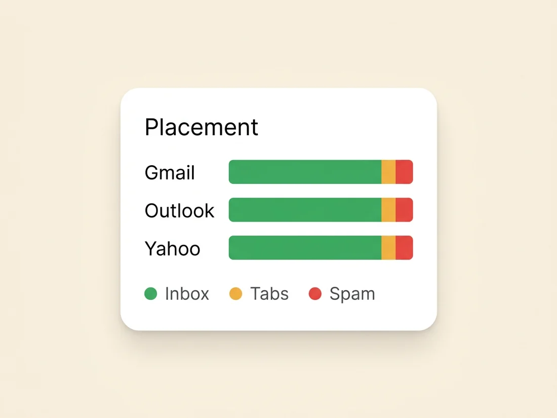
10. Test the design against real filters before the send. Everything above stacks the odds; testing proves them. Run the finished email through a spam scorer to catch content and structure flags, then send it to seed accounts across Gmail, Outlook, and Yahoo and see where it actually lands: inbox, Promotions, or spam. Design changes move placement in measurable jumps, and seed testing is the only way to see the jump before your list does. You can score a draft in our free spam checker and measure real placement with seed-based inbox placement testing.
Email design and deliverability for cold senders: less is more
One sharp exception to everything marketers assume: if you send cold outreach, the best design is almost no design. A cold email should look like a message a human typed: plain text, no images, no buttons, one link at most, under 120 words. Heavy HTML templates scream "bulk" to a filter that already views an unknown sender skeptically, and they scream "mass mail" to the person reading. Every point above still applies, but for cold email the winning application is restraint.
Design is also only one layer. A perfectly designed email still lands in spam if the list is dirty, the domain is cold, or authentication is broken, which is why SpamCipher runs the whole chain in one platform: campaign leads are verified before the first send, warm-up runs on its own seed network, the Deliverability Agent throttles or pauses a mailbox when complaints or bounces climb, and placement tests on seed mailboxes show where each campaign lands. SpamCipher is an AI-powered sales engagement platform, B2B lead intelligence database, and email deliverability and security suite in one product, and that is the part of it that handles what design cannot touch. Fix the design with the ten ways above, then let the platform handle the rest; the full system is laid out in how to own the inbox.
See where your design actually lands
Score your draft in the free spam checker, then run a seed placement test and watch where Gmail, Outlook, and Yahoo really put it. Measured placement, not guesswork, in the same platform that runs unlimited sending on ONE (per-mailbox caps) and automated cold email.
Test your email design